Final logo in three sizes. As I was finishing my work I made the graphic on the logo smaller and alligned it with saturn and publishing, before it was a bit bigger and came across.
Tuesday, June 12, 2007
Logo
Final logo in three sizes. As I was finishing my work I made the graphic on the logo smaller and alligned it with saturn and publishing, before it was a bit bigger and came across.


Business Card Details
A page from a corporate indentity manual describing the specifications of the business card.


Bus
The business bus which comes in two opions. Like the first assignment, I had a little more trouble putting the graphics and logo on the bus than the van.


Sign
This is the business sign. It includes the logo, secondary graphic as the background and some details some people might want to get as they walk or drive past. At night it gets lit up by special lights.


Corporate Identity
This is the colour palette which includes my primary and secondary colours.

This is the corporate font and secondary graphic.


This is the corporate font and secondary graphic.

Wednesday, May 30, 2007


Wednesday, May 23, 2007
Week 10
This week in class I worked on my logo.. didn't really get anywhere.. I dont like any of them.


Wednesday, May 9, 2007
Week 8
For this class we learnt how to do style sheets in InDesign. This is briefly how I learnt to use it:
- select text and edit font/colour/size etc
- click on new paragraph style, name it
- click on other text then on the name of new paragraph style to make this the same
- can have many as many different new paragraph styles as you need
- enter is page break
- for tabs, you can edit new paragraph style which is found in side options
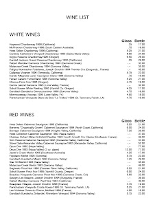
To understand this better we created a menu using this
Heres 2 out of 6 pages of my menu

- select text and edit font/colour/size etc
- click on new paragraph style, name it
- click on other text then on the name of new paragraph style to make this the same
- can have many as many different new paragraph styles as you need
- enter is page break
- for tabs, you can edit new paragraph style which is found in side options
To understand this better we created a menu using this
Heres 2 out of 6 pages of my menu


Wednesday, May 2, 2007
Week 7

This was our first class back for Term 2. We started our new assignment - Rings of Saturn Publishers. We had to find logos on the internet and then make logos from them - include elements that we liked from that logo. This is what I done in class.
Monday, March 26, 2007
Week 5 Reading
The reading on "Text" (www.papress.com/thinkingwithtype/resources/crimes_scale.htm) included descriptions on
Tracking, Height, Width, Kerning and Aligment (Justufued, Flush Left, Flush Right, Centered) which will all help me with text when designing a logo. The one that has helped me the most is Kerning which I have started to experiment with when designing. I had learnt about this in class and from the reading.
Tracking, Height, Width, Kerning and Aligment (Justufued, Flush Left, Flush Right, Centered) which will all help me with text when designing a logo. The one that has helped me the most is Kerning which I have started to experiment with when designing. I had learnt about this in class and from the reading.
Monday, March 19, 2007
Week 4 Reading
The reading on Revenge of the Brand (http://revengeofbrandx.com//brandx/) was enjoyable to read. Frankel stated that noone truely understands what a brand is which I think is true because if someone had asked me I probly would'nt of known how to explain it... or if I did it would be excately right. He asked What is Branding? and had 4 responses which were
1. That thing they burn into cows
2. A logo or a trademark
3. A jingle or a slogan
4. I dont really know, but ill look like a complete idiot if I admit it
I would of said 2 but the answer was 1.
Another defintion in the reading was Branding is about differntiation, making it easy for people to tell you apart from the next person trying to
Frankels 3 Laws of Branding
* Branding is not about getting targets to choose you over your competition. Branding is about getting your prospects to see you as the only solution to their problem
* Advertising grabs their minds. Branding gets their hearts
* Branding is not about you. Branding is about them
A list of what makes a good brand was also listed
1. Delivers the message clearly
2. Communicates quickly
3. Projects credability
4. Strikes an emotional chord
5. Motivates and respondent
6. Creates a strong user loyalty
Monday, March 5, 2007
Week 2 Reading
The reading on wikipedia (Http://en.wikipedia.org.wiki.Logotype) about logos included what an logo is and when it is used and elements of a good logo. In the section on “Logos Today” I learnt the differene between a slogan (different slogans for different advertising campaigns) and a brand slogan (remains the same for a long time to build up the brands image). The logo designed included a list of things that were suggested to do when designing a logo an then used examples of well known companies. Some of the suggestions were to use vector graphics so the logo can be resized without loss of fidelity and avoid being over the top to be unique which I think is a very important one to remember when designing.
The reading on wikipedia (http://en.wikipedia.org/wiki/Corporate_identity) about corporate identity showed two different definitions. The first being the "persona" of a corporation which is designed to accord with and facilitate the attainment of business objectives and is usually visibly manifested by way of branding and the use of trademarks and is viewed as being composed of 3 parts:
Corporate Design (logos, uniforms)
Corporate Communiction (commericals, public relations, infomation) and
Corporate Behaviour (interna values, norms)
The 2nd definition being the Organisational Point of View which defines corporate identity as being the way company actors make sense of their company in social interaction with other actors, shared perceptions of reality, way to do things and interlocked behaviour, actors are equal importance as others and actors construct different identiities in different contexts.
Subscribe to:
Posts (Atom)